Central Park Conservancy
An intensive study to find the painpoints on the CPC website
Overview
The Central Park Conservancy (CPC) is a private, nonprofit organization whose mission is to restore, manage and enhance Central Park in partnership with the public. They have been known as industry leaders in the field of urban park management, providing accurate and timely info about events and themselves as caretakers of the park. We worked with CPC's Senior Web Manager, Libbie Hayward to find why the Calendar of Events is hard to use.
Details
| Class | Research Methods |
| Toolkit | Ethn.io, Sketch, InVision |
| Collaborators | Scott Cowell, Yue Yuan, Ning Xu |
| Mentor | Jodi Leo, SVA |
Problem
Currently, the Calendar of Events at centralparknyc.org/events is hard to navigate, use and is a painpoint for users, including supporters of the park. The online Calendar of Events needs to change to meet the organizational goals. The CPC team wanted us to inform a new design that they would iterate and build upon.
A few questions to help us achieves the goal were:
- How is the content on the Calendar page used?
- What is working about the content, what is not working?
- How do participants interact with the page and the event popover on desktop and mobile
- How do people plan their visit to the Park? Do they plan using the Park’s site?
- Do they use another site or social media property?
- Is their mindset more about what to go out and see, what to avoid, or something else?
Contribution
I lead the academic research, conducted 1 of the 2 interviews and lead the mapping of research to discover insights, and designed the final hi-fi prototypes in InVision.
Process
- Screening: Participants were screened via a live-intercept invitation, questionnaire and qualified based on residential proximity to the Park (within a 12-block radius) and likeliness to support.
- Recruiting: Digital screeners were launched on the homepage and calendar page of centralparknyc.org for a 6-hour duration to recruit participants and selected according to how well they meet the screening criteria.
- Interviews: 30-minute remote moderated interviews were conducted, observing participants via GoToMeeting screen sharing tool.
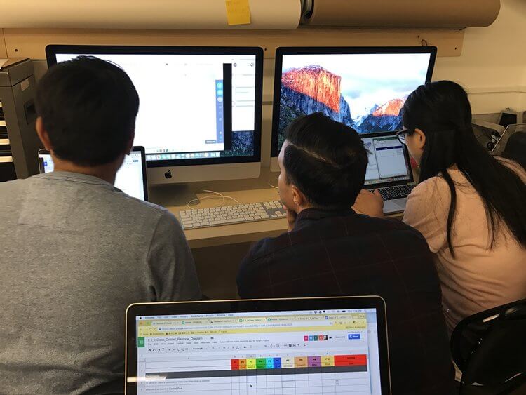
- Debrief: Deeper synthesis and analysis of research artifacts (Verbatim notes, video of each session, debrief notes and charts)

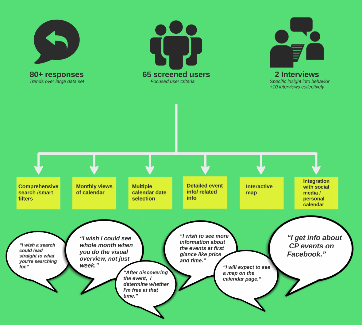
Mapping the Research
Find opportunities

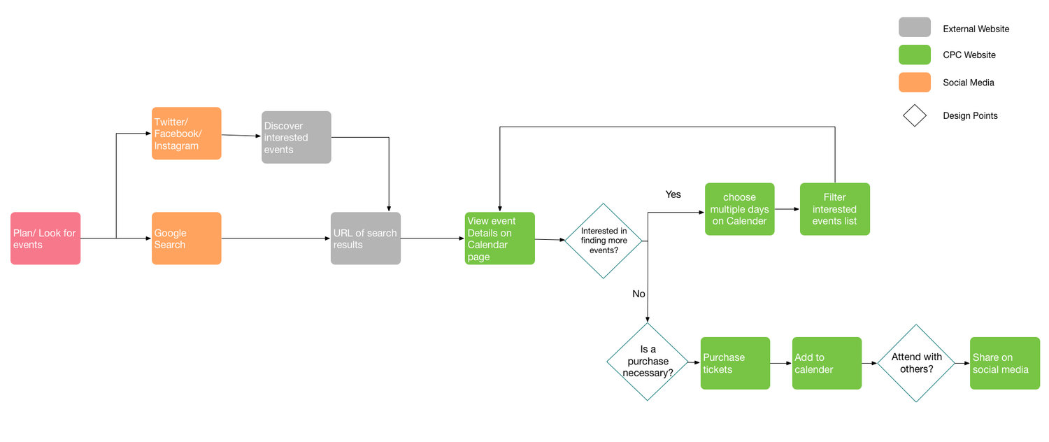
User flow

Early drafts
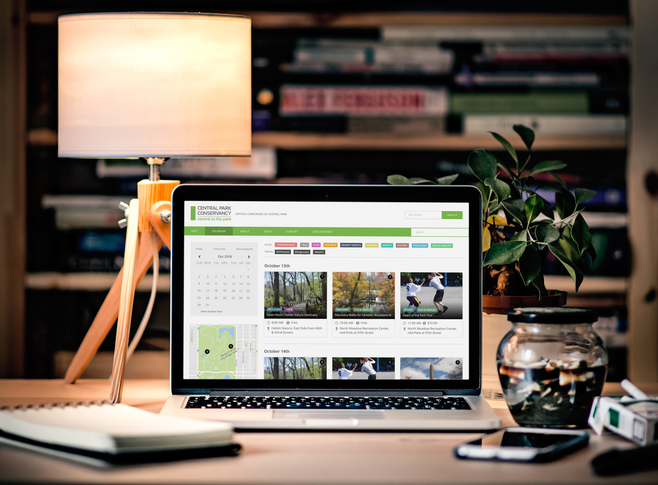
Final deliverable
When we ran the designs through our stakeholder and we got some good feedback on what's working and what isn't. A few things that were appreciated are the smart filters, calendar picker, interactive map & numbered cards. Things that were criticized are infinite scrolling and not having a dedicated page for each event which can affect the SEO and social media visits of the website. Since the goal of the project was only to inform the new designs that the stakeholders can iterate upon, we didn't test the new designs with actual users. That said, the stakeholder was very happy with the research, personas, scenarios, and the final deliverables.
